Work for end of year group exhibition cont’d:
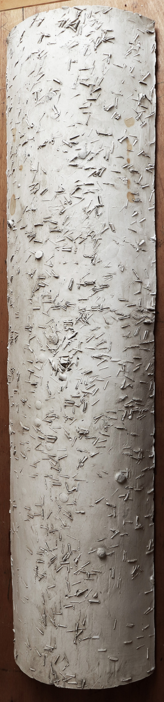
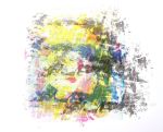
I had initially planned two possible pieces of work for the end of year group exhibition. My preferred option was to cast a section of telephone pole in plaster. The second option (Plan B) was to make an A1 size work using image transfers of my mono prints and collage on a canvas or fabric ground. As the outcome of my plaster cast was successful I was able to exhibit that work.

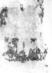
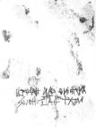
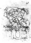
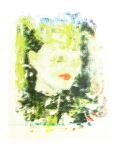
M. McCune-Colbert, Traces of the Past, 2018
For a five minute presentation, speaking about my work, I decided to give some background to my way of working and an overview of how the exhibited work had come about. This sculpture was inspired by Rachel Whiteread’s exhibition at Tate Britain, which I had attended earlier this year.
This slideshow requires JavaScript.
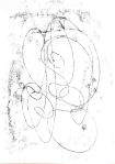
Rachel Whiteread exhibition 2018 – photos M McCune-Colbert
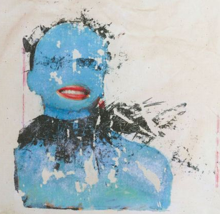
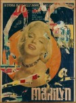
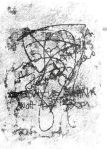
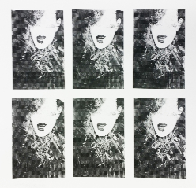
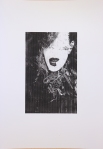
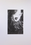
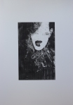
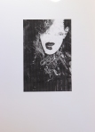
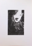
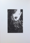
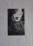
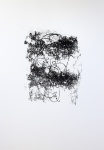
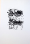
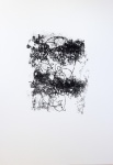
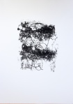
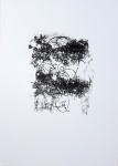
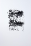
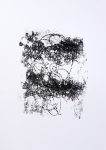
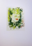
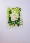
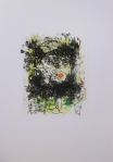
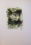
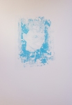
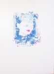
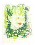
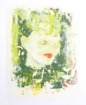
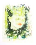
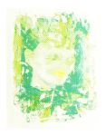
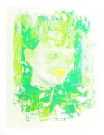
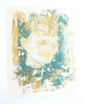
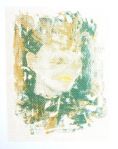
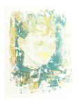
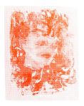
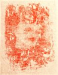
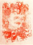
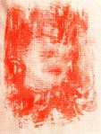
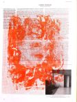
My sculpture is conceptually linked to my previous work, which includes research on Mimmo Rotella, who used torn advertising posters found near his studio in Rome. I associate the fragmented eroded quality of my image transfers with the fragmented posters used by Rotella. The physical damage to the materials communicates impermanence and transience. Several telephone poles near my home are covered in staples, the remaining evidence of flyers advertising past events. I am fascinated by the way we bring our associations to physical objects and see them in a symbolic way.
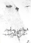
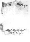
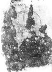
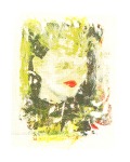
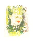
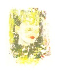
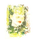
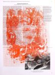
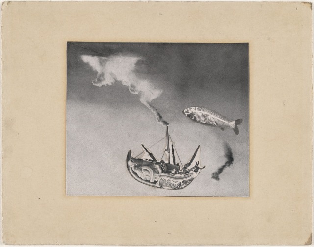
M. Rotella, Marilyn, 1963 [Left] M.McCune-Colbert, Untitled, 2018
Keynotes for 5 minute presentation
Process & Materiality
Very recent piece of work made over the Easter break
Departure last term printmaking – screen printing – photocopy transfers
circle back to casting workshop at the beginning of this unit
Freedom to experiment move between processes and materials
Use of digital processes e.g digital photography, image processing
Physical material and objects from the world around me very important
both in terms of my response to objects and use of materials – assemblage, collage etc
Use of physical materials and physical processes central
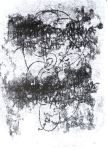
things can go wrong, lead to new developments in my work practically and conceptually e.g. rust marks – could lead to whole new line of thought
So how did this work come about?
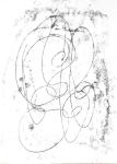
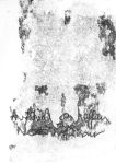
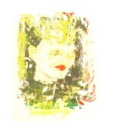
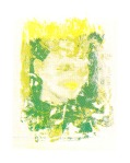
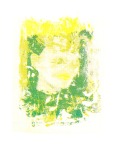
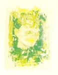
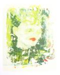
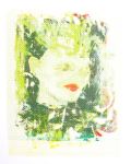
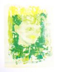
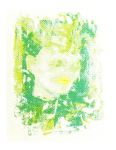
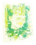
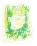
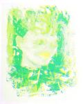
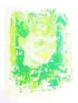
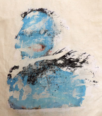
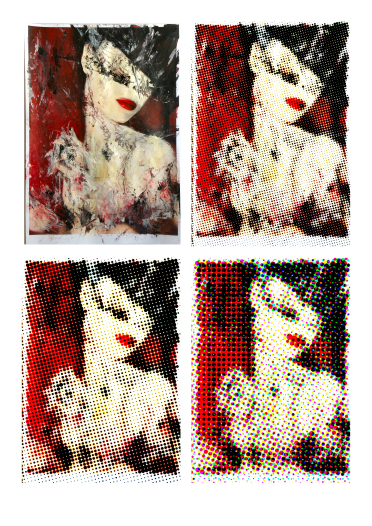
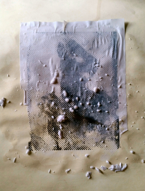
Transferring photocopies onto fabric
during process parts of image detached
fragmented eroded quality
reminded me of Mimmo Rotella’s work – torn posters from the streets of Rome
Recently taking photographs locally –
several telephone poles had fascinated me long-time
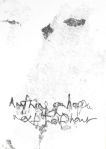
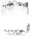
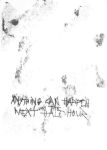
staples and tacks – all that remained of flyers advertising local events lost pets
representing years of human activity, energy, emotion, hopes and fears.
Fascinated by how objects can carry Traces of the Past – title of my work
Interested in how we bring our associations to objects – something I will continue to explore
These poles became symbols of impermanence and transience, a theme that I connect with Rotella’s décollage work.
Digital Photographs but wanted to create something more physical to explore the subject further – my response both emotional and physical
Cast of the telephone pole
Rachel Whiteread exhibition
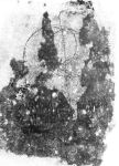
Clay mould – relief impression – plaster cast –
deciding whether to paint –
decision not to paint – archaeological casts – fragments of the past
left traces of clay and accidental metal stains add to the sense of wear and tear.
neutral material draws attention to the surface – lighting
object in its own right rather than a painted representation – fake
more mysterious – more open to interpretation
This work so recent
there is much more for me to discover about it and where it might lead.